 CyberCode
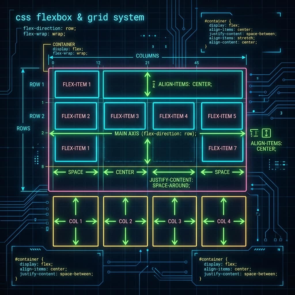
web-development · Intermediate · 2026-07-04
CSS Flexbox: Build Responsive Layouts the Easy Way
Master CSS Flexbox step by step — rows, columns, alignment, spacing and wrapping — and build a responsive card layout in the live editor.
Before Flexbox, centring things in CSS was famously painful. Today, display: flex solves 90% of everyday layout problems — navigation bars, card grids, sidebars, centring — with just a handful of properties.
The two players: container and items
Flexbox always involves a flex container (the parent) and flex items (its direct children):
.container {
  display: flex;   /* this one line activates flexbox */
}
The moment you set display: flex, all direct children line up in a row. That's the default — and everything else is adjustment.
Direction: row or column
.container {
  flex-direction: row;      /* default: left to right */
  flex-direction: column;   /* top to bottom */
}
The two alignment properties you must know
This is where most beginners get confused, so remember one rule: justify = main axis, align = cross axis.
.container {
  justify-content: center;   /* along the direction of flow */
  align-items: center;       /* perpendicular to the flow */
}
With flex-direction: row, justify-content controls horizontal spacing and align-items controls vertical alignment.
Common justify-content values:
| Value | Effect |
|---|---|
flex-start | Pack items at the start (default) |
center | Centre the items |
space-between | First and last touch the edges, equal gaps between |
space-around | Equal space around every item |
space-evenly | Perfectly equal gaps everywhere |
The classic "centre anything" recipe
.parent {
  display: flex;
  justify-content: center;
  align-items: center;
  min-height: 100vh;
}
Whatever is inside .parent is now perfectly centred, horizontally and vertically.
Spacing with gap
Forget margin hacks — gap adds space between items only:
.container {
  display: flex;
  gap: 12px;
}
Wrapping and flexible sizing
Two properties make layouts responsive without a single media query:
.container {
  flex-wrap: wrap;        /* items drop to the next line when tight */
}
.card {
  flex: 1 1 150px;        /* grow, shrink, minimum 150px wide */
}
flex: 1 1 150px means: each card wants to be at least 150px, can grow to fill spare space, and can shrink when needed. When the screen gets narrow, cards wrap onto new lines automatically.
Try it yourself
The editor below contains a responsive card row using exactly this technique. Try these challenges:
- Add a fourth and fifth card — watch them wrap automatically.
- Change
justify-contenttospace-betweenand observe the difference. - Switch
flex-directiontocolumn. What happens to the cards? - Change
flex: 1 1 150pxtoflex: 0 0 150px— the cards stop growing. Why? - Bonus: make the second card twice as wide as the others with
flex-grow: 2.
Press Run after each change to see the result instantly.
Practice exercises
Three small builds, each a real-world flexbox pattern, using the editor below.
Exercise 1 (easy): Centre the whole card row vertically in the preview using the "centre anything" recipe from above — give .container a min-height: 80vh and the right alignment properties.
Solution:
.container {
  min-height: 80vh;
  align-items: center;   /* justify-content: center is already set */
}
Exercise 2 (medium): Build a navbar above the cards: in the HTML tab add a <nav> with a "LOGO" span on the left and three links on the right. The classic pattern is display: flex + justify-content: space-between.
Solution:
<nav class="navbar">
  <span>LOGO</span>
  <div><a href="#">Home</a> <a href="#">Tools</a> <a href="#">Blog</a></div>
</nav>
.navbar {
  display: flex;
  justify-content: space-between;
  align-items: center;
  padding: 12px 20px;
  background: #0E1620;
  color: #4ADE80;
}
Exercise 3 (challenge): Make the first card act as a full-width "featured" banner sitting on its own line, with the rest of the cards wrapping below it. One property on a new class is enough. (Hint: what does flex-basis: 100% do when flex-wrap is on?)
Solution:
.featured {
  flex-basis: 100%;
}
<div class="card featured">Featured card</div>
Practise what you learned
Edit the code below and press Run to see your changes live.
Test yourself
Answer from memory first, then check yourself against the answer.
Q1What is the difference between justify-content and align-items?
justify-content distributes items along the main axis (the direction of flow); align-items aligns them on the cross axis (perpendicular). With flex-direction: row, justify-content is horizontal and align-items is vertical — swap the direction and they swap too.
Q2What do the three values in flex: 1 1 150px mean?
flex-grow (1 = may grow to fill spare space), flex-shrink (1 = may shrink when space is tight) and flex-basis (150px = the starting size before growing or shrinking).
Q3Why use gap instead of margins between flex items?
gap adds space only between items — no stray margin on the first or last item, no negative-margin hacks. One property on the container replaces margin rules on every child.